Practical
For my investigate study I did a practical part. The pipeline began with finding research material and reference.


I want to recreate or make the same atmosphere like you will find in some blockbuster film and create something that will pop more on the screen and become a symbolism in the storytelling. I also would drain some colours and see if it would make the shot different.
First, I started to film multiply shots. The goal was to create some good-looking shot that I would colour correct and colour grade in different moods and atmosphere. Next step was to choose a shot that I would like to use. Even though I used iPhone 12 camera the quality was not perfect, but good enough to do some colour changes. If I had used a better camera the colour changes and to manipulate the colour would have been more advanced. I filmed some in the Christmas holiday in Norway and in a park next to where I live in London.
Gunnersbury Park & Museum


Hometown Norway


I choose two clips I would like to change colours and to create some looks. Those where one with my dog Luna in the snow and another with my friend Rakel walking up some stairs into a building.
In After Effects the first thing I did was to do some adjustments and editing an environment that feels natural. Sometimes when shooting you can get unlucky with the shot and the colour might express a green or some funky colours. The first thing I did was to balance the white and black by using the levels and I also played with the temperature tool for a natural look.
First, I choose the clip with my friend Rakel in it and tried to create three different appearances with the same shot. The first look I went for was to create a dramatic look. The look is to get so close as possible to a realistic look, like it would look through a human eye. To create a dramatic look, we need contrast and intense colours. Since the scene was blue, I used curve tool to drag the blue a little down to and make the colours more balanced. I played with the hue/saturation tool and put the master Saturation to –16.

The second look I went for was to create an action/Sci-fi or a matrix look. To create a Matrix look I really had to push the colour green. I used Tint tool to map black to a dark green colour and map white to a light-yellow colour. Then I used vibrance tool to 37 to create an extreme appearance. Then I tweaked the greens in the highlights with the lumetri tool.


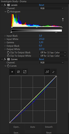
The third was to create a horror look. Like drama horror need to balance the whites and black to create a realism glance. I used levels and put black to 3 and white to 227. I want a blue and contrasted impression, so I used curves and created a S curve in the blues, and I also put the green a little down. For fun I used a Photo filter tool to create an overall look for the shot and I also wanted it bluer. Since horror movies are scary and cold, I went with a cold look. I ended up with Cooling Filter (80) to 25%, because I find it a great style for horror. Then the blue become the dominant colour. So, I tried to push the other colours by using curves in Lumetri colour tool, I also played around with the tint tool. Then I want an overall filter, so I activated sl clean kodak b in lumetri colour tool and sat the intensity to 12.


The second shot is with the dog in the snow. This shot will have two different looks, the story telling is going to be something like you will find in Disney Pixar. One playful and happy look and another sad and sorrowful look, like a nostalgia look. The second clip with Luna, the first look was to create a gentler colour, soft contrast and gives a peaceful scene. For this shot I used lumetri colour and played around with the temperature and saturation. I sat the temperature to 17 and saturation to 121 for a warmer look. I also played around with the levels tool. Since this was going to be a softer look, I put the black down to –5,1.


In contrast I create a desaturated appearance and pouched the contrast to make a drained look. I played with the levels and pushed the input black to 15 and white to 275,4. I also used CC Colour offset and change the red phase to –9,0°, to take away some of the red colours and made the scene a colder look. I used vibrance tool and pushed it down to –37. Then I used a Unsharp Mask tool to amount 79, to pop the contrast even more.


The last thing I did was to go through all the shots and tweaks some of the creative setting. Some of the shots I added a lumetri Colour panel on an adjustment layer to create a unique feature. Then I created another adjustment layer and added vignette and motion tile for a cinematic style.


VIDEO


Original
Drama


Horror
Matrix

Original

